The 10 Art Styles AI Does Best (and How to Prompt Each)
Generative AI is not equally good at every kind of art. Ask it for clean text or a precise logo and it falls apart. Ask it for the loose color of an Impressionist garden or the hard light of a Baroque portrait, and it turns out something you would actually frame. The trick is knowing which styles play to its strengths. These are ten our AI does well, the story behind each, and a prompt you can paste straight into the studio to make your own.
Abstract Expressionism
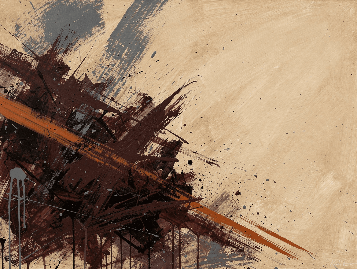
Abstract Expressionism is the movement that made New York the center of the art world, roughly 1945 to the late 1950s. It threw out the subject entirely: no people, no places, just raw color, scale, and the physical act of painting, on canvases big enough to swallow you. Here is the part most people do not know. During the Cold War, the CIA quietly helped promote it through front foundations, precisely because it looked like freedom next to the rigid, state-approved realism coming out of the Soviet Union. A movement about pure, ungoverned expression became, for a while, a piece of government strategy.
The movement split into camps. Jackson Pollock laid his canvas on the floor and flung and dripped house paint across it, earning the nickname Jack the Dripper and an all-over style with no center and no up or down. Willem de Kooning attacked the figure instead, his Woman paintings all slashing strokes and bared teeth. Franz Kline stripped it down to enormous black girders of paint on white, like architecture mid-collapse. Same energy, three completely different ways to spend it.
This is the rare style where the model cannot really get it wrong, because there is nothing to get right. No anatomy to fumble, no perspective to break. Commit to a specific, slightly unexpected palette and a strong off-center composition, then ask for the marks themselves: dragged strokes, drips, scrapes, layered color. Try this: "Abstract expressionist composition, gestural and full of energy, a dense mass of deep maroon and charcoal brushwork sweeping diagonally across a warm bone ground, one decisive burnt-orange stroke, trailing drips and scattered specks, weight pushed off-center, matte flat color with no thick texture." Open the studio →
Bauhaus
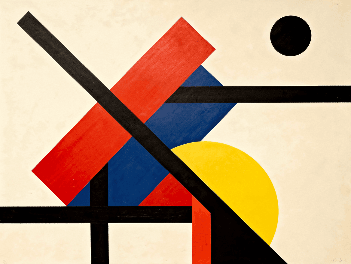
The Bauhaus was a German school, founded in 1919, that fused art, craft, and industrial design into one idea: clean geometry, primary color, and form that follows function. It ran for only fourteen years, but it rewired how the modern world looks, from your sans-serif fonts to your tubular-steel chair. Then the Nazis killed it. They branded the school degenerate and un-German and forced it to close in 1933. The plan backfired spectacularly. Its teachers scattered across the globe and planted Bauhaus thinking everywhere they landed, carrying it to Chicago, to Tel Aviv, and into the glass towers that now define every city skyline. An attempt to erase a school turned it into the default language of modern design.
The faculty was a roster of giants who agreed on principles and almost nothing else. Walter Gropius founded it as an architect chasing one total, unified design. Wassily Kandinsky taught there while painting loose, musical abstractions with little of the hard Bauhaus edge. Paul Klee worked small and playful, all whimsy and symbol. And Mies van der Rohe, the final director, took it toward severe glass-and-steel minimalism and the phrase less is more. The shared grammar was geometry and restraint. What each did with it could not have been more personal.
Bauhaus is a gift for the model because it is pure flat geometry, with no rendering or realism required. Name the primary colors directly, ask for hard-edged shapes, and force a strong diagonal so the composition balances through tension instead of symmetry. Try this: "Bauhaus geometric composition, hard-edged flat shapes in cadmium red, cobalt blue, and chrome yellow on a warm off-white ground, bold black bars and a single black circle, a strong diagonal creating asymmetric tension, clean flat color, precise edges, matte finish." Open the studio →
Color Field
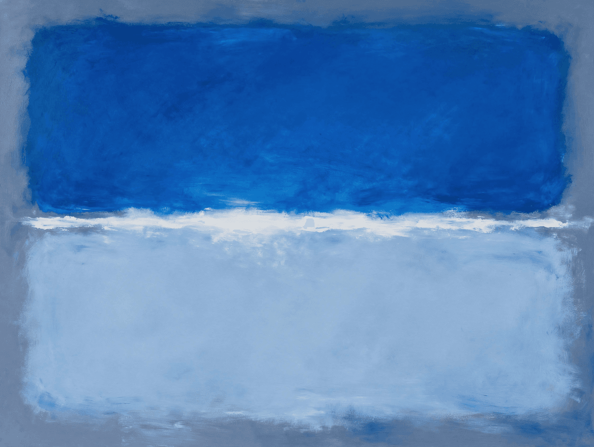
Color Field painting is Abstract Expressionism turned quiet. Instead of frantic gesture you get vast, soft-edged zones of color that seem to glow from within and pull you in close. Mark Rothko was its most famous voice, and he was deadly serious about it. He wanted his paintings to move people to tears and resented anyone who treated them as decoration. The story turns dark twice over. Rothko took his own life in 1970, and his estate then detonated into one of the largest art-fraud scandals on record: his own executors sold hundreds of his paintings to a colluding gallery for a fraction of their worth, until his daughter sued and won a landmark case that reshaped how artist estates are handled.
Rothko gets the headlines, but the field was wider. Barnett Newman reduced a painting to a single vertical stripe, what he called a zip, splitting a wall of color. Helen Frankenthaler poured thinned paint straight onto raw canvas so it soaked in like a stain, soft and weather-like. Clyfford Still went the other direction, all jagged, torn-looking edges and craggy color. Same idea, color as the entire subject, at wildly different temperatures.
Color Field is one of the easiest beautiful things to make with the model, and the whole trick is luminosity. Ask for soft, feathered edges and color that looks lit from within, keep it to two or three stacked fields, name a specific palette, and steer it away from muddy or dark, which is the one way it fails. Try this: "Color field painting in the spirit of Rothko, luminous and light-filled, two soft-edged rectangles of glowing color stacked on a warm ground, feathered blurred edges with no hard lines, color lit from within, calm and meditative, matte finish, not dark, not muddy." Open the studio →
Baroque
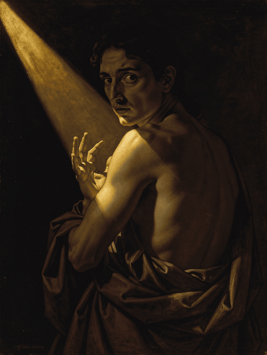
Baroque is the high-drama era of European painting, roughly 1600 to 1750: deep shadow, hard light, and the feeling that something is about to happen. Its signature move is tenebrism, where a single light source drags a figure out of near-total black, and the man who made that look famous was Caravaggio. He was also a menace. Between commissions he brawled through Rome with a sword, kept a running police record, and in 1606 he killed a man named Ranuccio Tomassoni, which earned him a papal death sentence: an open bounty that let anyone in the Papal States kill him on sight. He spent his last four years on the run, painting some of his finest work between cities, and at one point worked his own face into a canvas as the severed, screaming head of Goliath, a guilt-soaked self-portrait he sent to the cardinal who had the power to pardon him. He died at 38 on a beach, still chasing that pardon.
Caravaggio cast a long shadow, literally. Rembrandt borrowed the same light-from-darkness but turned it warm and inward, trading street-level menace for quiet portraits lit like confessions. Rubens went the other way entirely: color, motion, and fleshy abundance, all swirling energy where Caravaggio held still. And Artemisia Gentileschi took his tenebrism and aimed it at fierce, vengeful heroines, painting a woman beheading a general with more conviction than any man of the era dared. Same darkness, wildly different temperaments.
Baroque works on our AI because the style is about light, not fine detail, and the model is excellent at dramatic light. The trick is to demand one hard light source and a near-black background, then let the shadow carry the scene (it also hides the spots the model fumbles, like hands and crowds). Keep it to a single subject: one figure half-swallowed by the dark, or a still life of fruit, wine, and a skull. Try this, then push the light around until the scene feels like it is hiding something: "A single figure emerging from near-total darkness, lit by one sharp raking beam of warm light from the upper left, most of the body lost in shadow, deep black background, warm umber and crimson, golden lamplight on skin, dramatic chiaroscuro, old-master oil." Open the studio →
Impressionism
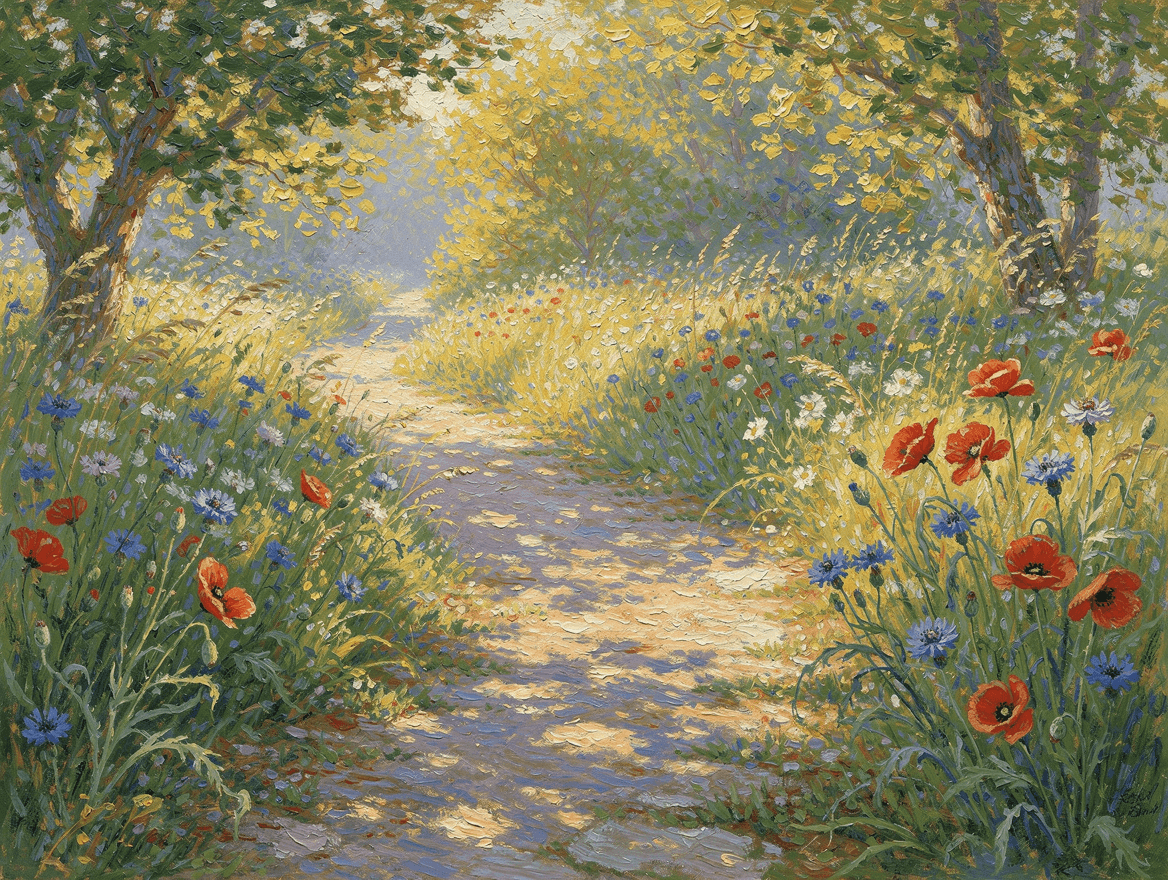
Impressionism is the sound of paint loosening up. In 1870s Paris a group of painters walked out of the studio to catch light and weather and modern life as it actually looked, in quick broken strokes you can see from across the room. The establishment hated it. When Claude Monet showed a hazy harbor scene called Impression, Sunrise, a critic sneered that it was a mere impression, unfinished like wallpaper, and mockingly called the whole group Impressionists. They had already been rejected by the official Salon and were showing on their own. So they took the insult, put it on the door, and named the most beloved movement in art history after a put-down.
The label covered very different hands. Monet chased pure light, painting the same haystack or cathedral over and over as the sun moved. Pierre-Auguste Renoir preferred warm, glowing people, dance halls and lunch parties full of soft skin and good wine. Edgar Degas barely counted himself one of them, drawing ballet dancers from strange backstage angles with a draftsman's precision. And Berthe Morisot, one of the movement's leaders, painted intimate domestic moments most of the men never saw. Loose brushwork was the only thing they all shared.
Impressionism plays straight to the model's strengths, because the whole style is about light and color rather than sharp detail, which is exactly the thing it struggles with. Ask for broken color, visible brushstrokes, and dappled light, and give it a plein-air subject like a garden, a pond, or a field. Try this: "Impressionist painting in the spirit of Monet, a sunlit garden path through tall grasses and wildflowers, scarlet poppies and blue cornflowers, dappled afternoon light, short visible broken brushstrokes, warm golden light against cool lavender shadows, soft and atmospheric." Open the studio →
Romanticism
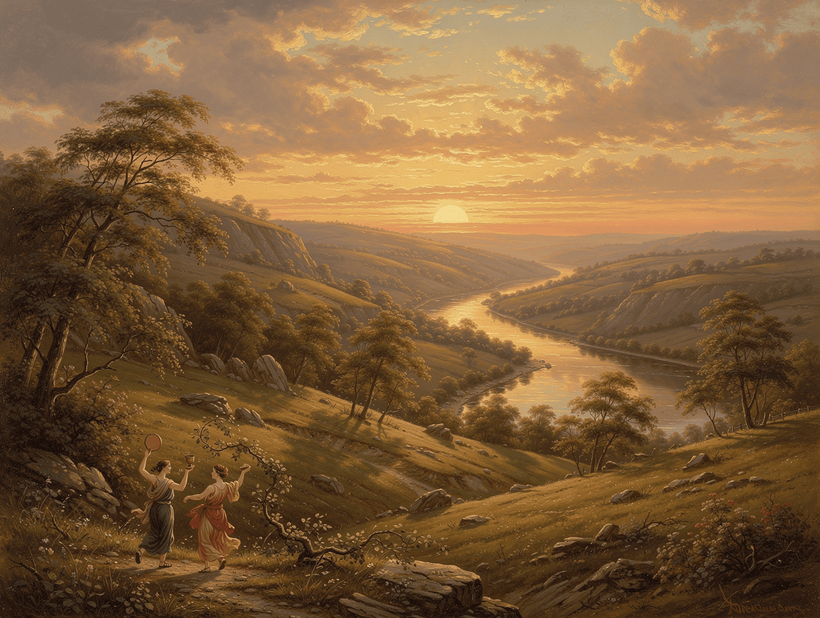
Romanticism was a revolt against cold reason. From the late 1700s into the mid 1800s its painters chased awe, terror, and the overwhelming power of nature, the feeling of being very small in front of something vast. The darkest masterpiece of the movement came from a real horror. In 1816 the French frigate Méduse ran aground because of an incompetent, politically appointed captain, and 147 people were crowded onto a makeshift raft and cut loose. After nearly two weeks of thirst, starvation, murder, and cannibalism, only about fifteen were still alive. Théodore Géricault became obsessed with painting it, interviewing survivors and studying bodies in the morgue to get the dead exactly right. The result, The Raft of the Medusa, turned a national scandal into a wall-sized accusation.
Romanticism ran hot and cold. J. M. W. Turner dissolved storms and sea into pure light, getting so abstract he looks a century ahead of his time. Caspar David Friedrich went silent and spiritual, placing a lone figure before fog and mountains. Eugène Delacroix painted political revolution in surging color and motion. And Francisco Goya turned toward nightmare, painting a god devouring his own child on the wall of his house. The common thread was feeling over order, turned up as loud as each painter dared.
Romanticism works because the model is genuinely good at sky, weather, and atmosphere. Lead with the landscape and the drama of the light, and keep any figures tiny, both because scale is the whole point and because small figures hide the model's weakness with anatomy. Try this: "A grand Romantic landscape at golden-hour sunset, rolling hills receding to a distant horizon, a low sun flooding the valley with warm amber light, long soft shadows, a winding river, painterly old-master oil, atmospheric and sublime, any figures tiny and far off." Open the studio →
Landscape Photography
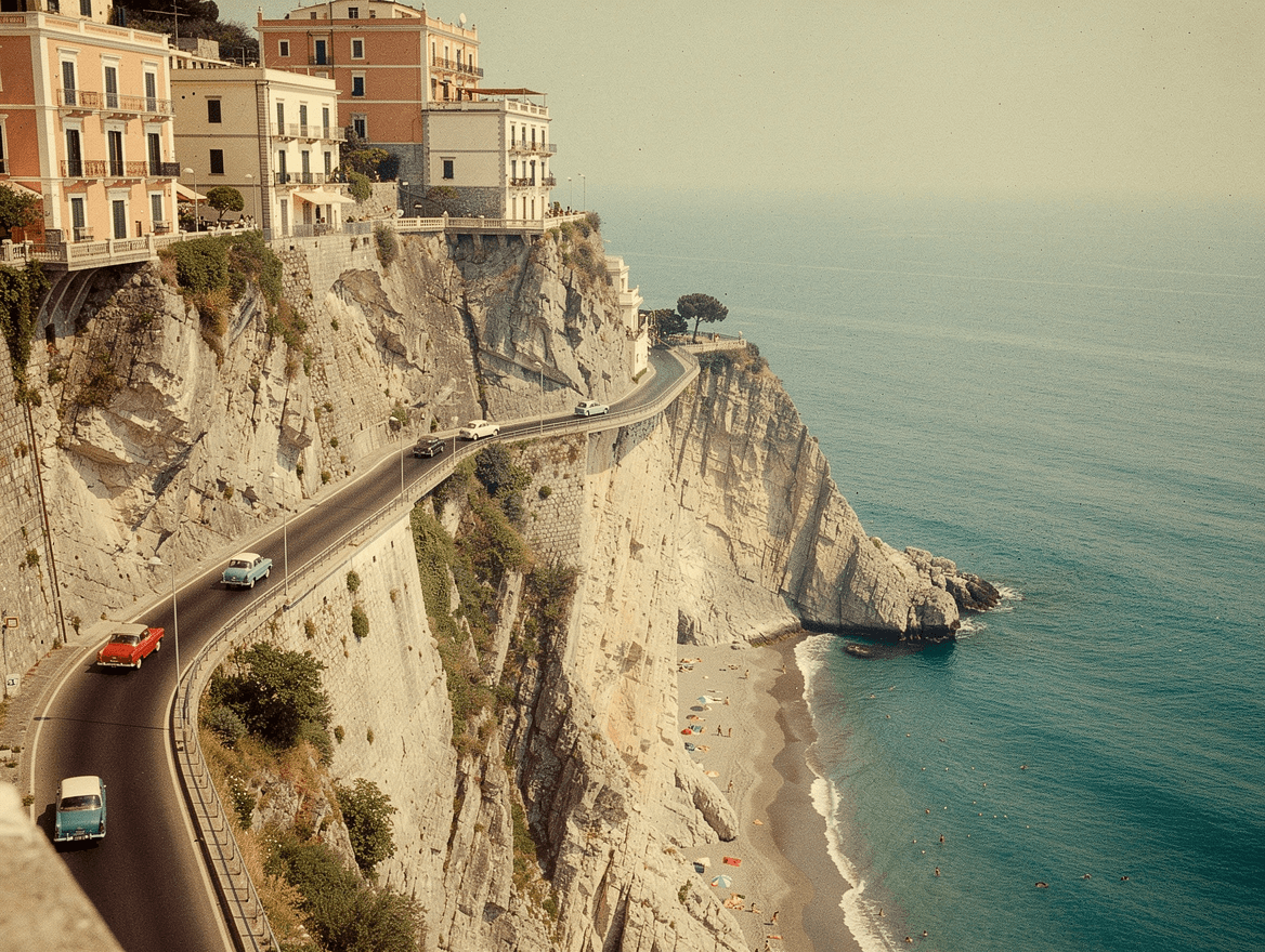
Landscape and travel photography is the oldest kind of escapism: a window onto somewhere better than wherever you are. The vintage, sun-faded look that sells so well right now traces back to photographers like Slim Aarons, and his story is the whole appeal in miniature. Aarons landed at Anzio and shot combat in the Second World War, earned a Purple Heart, and saw enough horror to last several lifetimes. He came home and decided he would only ever photograph the opposite: beautiful people doing beautiful things in beautiful places. He spent the rest of his career poolside in Italy and on the Riviera, and liked to say the only beach worth landing on was one full of beautiful people. The warm nostalgia in these images is a choice, made by a man who had seen the alternative.
Photography splits by what the photographer chases. Ansel Adams made the wilderness monumental in crisp black and white, waiting hours for the exact light over Yosemite. Aarons did the opposite, all warm color and easy glamour. Steve McCurry shot faces and places in saturated, story-heavy color. And Gray Malin updated the beach scene for the drone era, shooting straight down at neat grids of umbrellas. Same medium, four completely different reasons to raise a camera.
Photography is one of the model's strongest modes, but if you want that collectible vintage feel you have to ask for it directly. Name the era and the film, push for grain and sun-faded color, and shoot any people from far enough away that they read as tiny figures. Try this: "A vintage 1960s color film photograph of the Amalfi coast, a cliff road winding above a turquoise sea with a few small vintage cars, pastel buildings on the rock, a tiny distant beach below, warm sun-bleached Kodachrome color, heavy soft film grain, hazy and nostalgic." Open the studio →
Mid-Century Modern
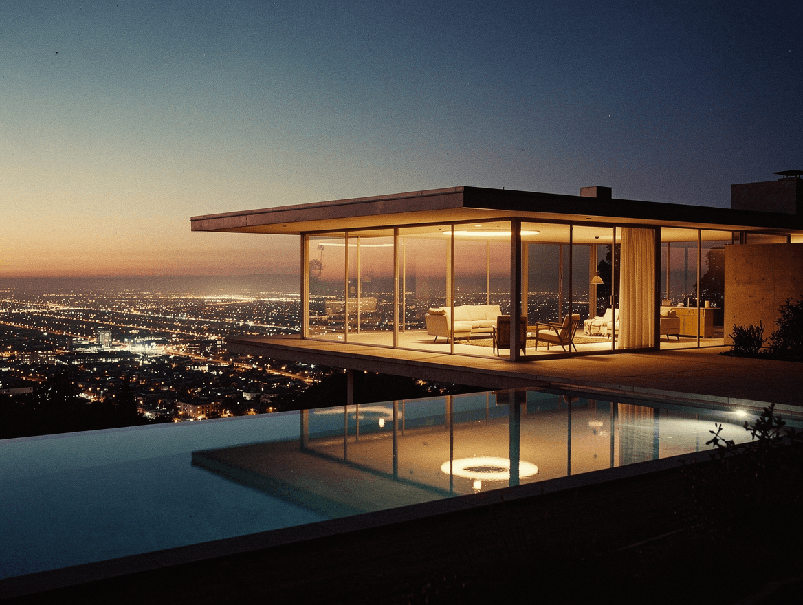
Mid-Century Modern is the optimistic design language of the postwar years, roughly 1945 to the late 1960s: clean lines, big glass, indoor-outdoor living, and a faith that good design could be for everyone. Its most famous image almost never existed. The Stahl House, Pierre Koenig's glass box cantilevered over the edge of the Hollywood Hills, sat on a lot so steep that banks refused to finance it and the owners had bought it cheap as unbuildable. In 1960 the photographer Julius Shulman shot two women sitting in that glass corner as the entire grid of Los Angeles glittered below them. The long-exposure photograph became the most famous picture of a house ever taken, and more or less sold the world on California modernism in a single frame.
The movement was a workshop of distinct visions. Charles and Ray Eames bent plywood and molded plastic into furniture you have almost certainly sat in, and built their own house out of off-the-shelf industrial parts. Eero Saarinen went sculptural and swooping, giving us the tulip chair and an airport terminal shaped like a bird. Richard Neutra set serene glass pavilions into the desert. Koenig chased the pure glass-and-steel box. The shared faith was simplicity and light. The forms ranged from austere to nearly cartoonish.
To make Mid-Century Modern that does not look generic, point the model at the architecture, not an abstract pattern. Ask for a glass-and-steel house at dusk with the city lights below and the same warm, grainy, faded film treatment, and it comes out looking like a print people pay real money for. Try this: "A vintage film photograph of a mid-century modern glass and steel house in the style of Pierre Koenig, cantilevered over a Los Angeles hillside at dusk, warm interior light glowing through floor-to-ceiling glass, a clean rectilinear pool, city lights spreading across the valley below, soft film grain, faded vintage color." Open the studio →
Line Art

Line art is the most disciplined kind of drawing: a whole subject described in as few continuous strokes as possible, with everything inessential thrown away. Its patron saint is Pablo Picasso, who could capture an animal or a face in one unbroken line. In 1949 the photographer Gjon Mili showed Picasso pictures of figures drawn in mid-air with light, and Picasso answered by grabbing a small flashlight and drawing in the dark: a bull, a centaur, a face, each one a single luminous gesture that vanished the instant he finished it. Mili caught them on long exposures. The drawings existed for about a second, and they are some of the most famous line drawings ever made.
The economy of the line attracts very different artists. Henri Matisse, near the end of his life and unable to stand at an easel, drew with scissors instead, cutting pure shapes from colored paper and calling it his second life. David Hockney never stopped, moving from pen portraits to drawing on an iPad with the same loose confidence. And Egon Schiele used line as a weapon, all nervous, angular, raw edges. The fewer the marks, the more each one has to carry.
Line art is the model's hard mode, so the prompt has to fight its instinct to add detail. Demand a single continuous line, very few marks, and no shading or interior texture, then keep the subject simple and surround it with empty space. A cup, a face, or a single plant works better than a busy scene. Try this: "An extremely minimal single continuous line drawing of a coffee cup with a curl of steam, in the style of a Picasso one-line drawing, one clean unbroken black line, no shading, no interior detail, lots of empty space on a warm off-white ground." Open the studio →
Retro / City Pop
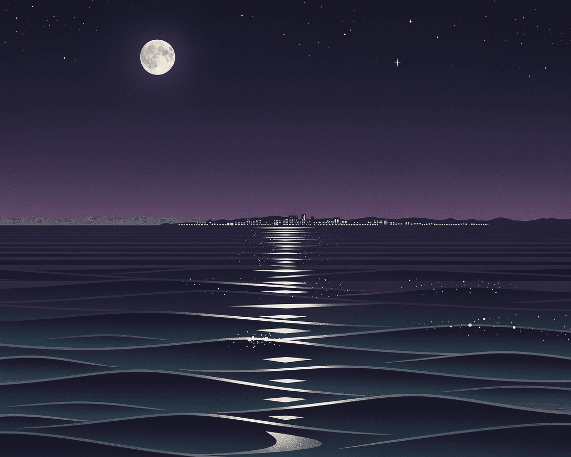
Retro, or City Pop, is the bright, clean, slightly melancholy look that came out of Japan in the late 1970s and 1980s: pools, palm trees, coastlines, neon, and endless summer, painted in flat, confident color. It belonged to a booming bubble-economy Japan and then quietly disappeared. The strange part is how it came back. Around 2017 the YouTube algorithm started pushing a 1984 song almost no one outside Japan had heard, Mariya Takeuchi's Plastic Love, to millions of listeners, and no one could fully explain why. A forgotten genre and its sunlit, nostalgic artwork went global on the recommendation of a machine, decades after everyone involved had moved on.
The look has a few clear authors. Hiroshi Nagai painted the definitive version, cloudless skies, still pools, and long shadows that feel like a held breath. Eizin Suzuki pushed it sharper and more graphic. And its modern descendants, vaporwave and retrowave, took the same palette somewhere glitchier and more ironic, all VHS haze and neon grids. The mood ranges from genuine nostalgia to knowing pastiche.
This one rewards naming the aesthetic directly. Ask for City Pop or 1980s retro, clean flat color, and idealized, nostalgic light, and give it a calm leisure scene: a pool, a coastline, a car at sunset. Keep it simple and graphic rather than detailed. Try this: "A retro city pop illustration in the style of 1980s Japanese album art, a calm moonlit sea under a deep blue and purple sky, clean flat saturated color, idealized nostalgic light, simple graphic shapes, serene and a little melancholy." Open the studio →
The pattern under all ten is simple. Our AI shines when a style is about color, light, mood, and gesture, and it struggles when a style demands clean text, precise geometry, or photographic perfection. Pick the one that fits what you want on your wall, steal the prompt, and make it yours.