How to Size Wall Art for Any Room
Most people hang their art too small. They stand in front of a blank wall, pick something that looked fine in the box, and end up with a 16 by 20 inch print stranded on a wall that wanted something three times its size. The art is rarely the problem. The size is.
Sizing is not a matter of taste. It is closer to arithmetic, and the arithmetic is short. Get two numbers right and almost any piece will look like it was meant for the wall. Get them wrong and the most beautiful print in the world will still feel off.
This guide covers the two rules that decide nearly everything, the right size for every common spot in a home, and a chart you can come back to the moment before you order.
Rule one: go two-thirds the width of the furniture
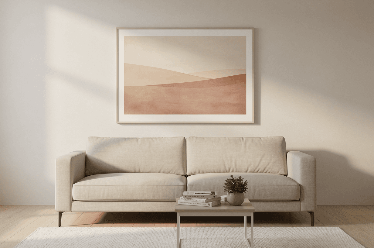
When art hangs above a piece of furniture, a couch, a bed, a console, a mantel, it should be about two-thirds the width of the furniture below it. That single ratio is the difference between a piece that anchors the wall and one that floats on it like a stamp on an envelope.
- An 84" sofa wants art around 56" wide.
- A 60" queen bed wants art around 40" wide.
- A 48" console wants art around 32" wide.
Two-thirds is wide enough to hold the wall and tight enough to leave the furniture room to breathe. You can push wider. A piece run nearly the full width of the furniture looks deliberate in a modern, minimal room. Going narrower than about half, though, almost always reads as a mistake, no matter how thick the frame.
Rule two: center it at eye level, 57 to 60 inches up
The second rule is height, and it is the one most people break. The center of the art belongs at eye level, which galleries and museums treat as 57 to 60 inches from the floor. The instinct is to hang toward the top of the wall. Resist it. Art tracks the center of the human eye, not the ceiling.
Above furniture, eye level sometimes competes with the old guideline of 8 to 10 inches above the top edge. Let the furniture decide:
- Low furniture, like a slim console or a bed without a headboard: use eye level.
- Tall furniture, like a high-backed sofa or a tall headboard: use 8 to 10 inches above the top edge, even if that nudges the center a little higher than eye level.
The right size, space by space
Above a couch
Sofas usually run 72 to 96 inches wide, so you want art in the 50 to 64 inch range. The cleanest options:
- One piece: a 28×40" landscape suits most sofas.
- A pair: two 18×24" portraits with a couple of inches between them.
- A trio: three 16×20" landscapes evenly spaced.
The one thing to avoid is a lone 16×20" floating above a full-size couch. It will look undersized every time.
Above a bed
Beds run 60" for a queen and 76" for a king. For either, a single 28×40" landscape above the headboard does the job, or two 12×16" pieces stacked one above the other for a softer look. Above a low headboard, a single 18×24" portrait centered on the bed works well.
For a twin or full, scale down to a 16×20" landscape or a 12×16" portrait, and do not let the art run past the width of the bed.
In a hallway
A hallway is a narrow corridor for the eye, so restraint wins. In a long hallway, run a series of three to five matching pieces, all the same size and frame, evenly spaced at eye level. In a short one, a single 16×20" or 18×24" is plenty. If you have never built a gallery wall, a hallway is the easiest place to start.
On an empty wall
This is where most people undersize. With no furniture beneath it to lend weight, the art has to carry the whole wall alone. On a standard 8-foot wall, start at 28×40" and do not be afraid to go bigger. Under a vaulted or double-height ceiling, go bigger still, or build a multi-piece arrangement that climbs the wall.
Walls that read from across a room, like a stairwell visible from the entry, need art that reads from across a room. This is the spot people undersize and quietly regret.
Above a console or mantel
Mantels and consoles tend to be 4 to 6 feet wide, which puts the art around 30 to 40 inches. A single 18×24" portrait or 16×20" landscape is the safe call. If the surface is already styled with vases, books, and smaller frames, you can size the art down, because those objects are sharing the visual weight.
Gallery walls
A gallery wall is a layout, not a single size, but it still obeys rules. Mix sizes freely, but keep one thing constant: the same frame, or the same mat color, or a single orientation. One repeated element is what turns a cluster of frames into a composition instead of a pile of separate decisions.
Plan it on the floor before you touch the wall. Lay the pieces out, shuffle them until the balance feels right, photograph the arrangement, then hang to the photo. It saves a wall full of nail holes. Keep 2 to 3 inches between frames; tighter reads as intentional and modern, looser starts to look uncoordinated. And the whole cluster still follows rule one: above a 72" sofa, the gallery's full outer width should land near 48", even if it is made of eight small frames.
For a first attempt, three pieces in a single row is the most forgiving layout there is.
A sizing chart worth keeping
| Space | Recommended size |
|---|---|
| Above a queen or king bed | 28×40" landscape |
| Above a sofa (72 to 84") | 28×40" landscape, or two 18×24" portraits |
| Above a sofa (84" and up) | 28×40" landscape, or three 16×20" landscapes |
| Above a console or mantel | 18×24" portrait, or 16×20" landscape |
| Hallway, single piece | 18×24" or 16×20" |
| Hallway, series | three to five matching 12×16" or 16×20" |
| Empty wall, standard ceiling | 28×40" minimum |
| Empty wall, vaulted ceiling | 28×40" portrait, or multi-piece |
| Small bathroom | 12×16" |
| Office, behind a desk | 16×20" or 18×24" |
| Nursery, above a crib | 12×16" or 16×20" |
The mistakes that cost a reorder
- Going too small. By far the most common error. When you are between two sizes, take the larger one. Almost no one looks at a finished wall and wishes the art were smaller.
- Hanging too high. The center belongs near 5 feet, not up by the crown molding.
- Ordering before measuring. Tape the outline on the wall first and live with it for a day. A minute of painter's tape beats a return.
- Matching the frame to the wall. A white frame on a white wall disappears. Let the frame contrast, even subtly.
- Forcing unrelated pieces into a set. Mixing clashing styles or palettes rarely works. Pick one through-line, color, era, or subject, and hold to it.
A two-minute check before you buy
- Measure the wall and the furniture under it. Write the numbers down.
- Apply rule one and pick a size from the chart above.
- Cut a rectangle of newspaper or kraft paper to that exact size, tape it to the wall, and leave it up for a day.
If the paper looks like the right amount of presence on the wall, the print will look the same. That is the whole test.
How this works on Horizons
We print four standard sizes, 12×16", 16×20", 18×24", and 28×40", each available in landscape or portrait. So once you have decided you want a 28×40" landscape above the couch, that is exactly what you order. No rounding to whatever a shop happens to stock.
The art itself is made to fit. You describe what you want, and the studio generates it at the exact aspect ratio of your chosen size, full bleed with no awkward white borders, printed on archival paper, framed in real wood if you like, and shipped across the US in 5 to 9 business days.
Pick the size first, using everything above. Then open the studio and make something that fits the wall exactly.