Abstract Wall Art: Why It Works, and Prompts to Make Your Own
Abstract is the best-selling kind of wall art, and it is not close. There is no subject to agree or disagree with, only color, shape, and mood, and you respond to those before you can explain why. That also makes it the most forgiving thing to generate with AI, and the easiest to match to a room.
Where abstract art came from
In the early 1900s a handful of painters stopped depicting the world and let color and form carry the feeling on their own. Abstract art was the result, and it split the difference between a picture and a piece of music.
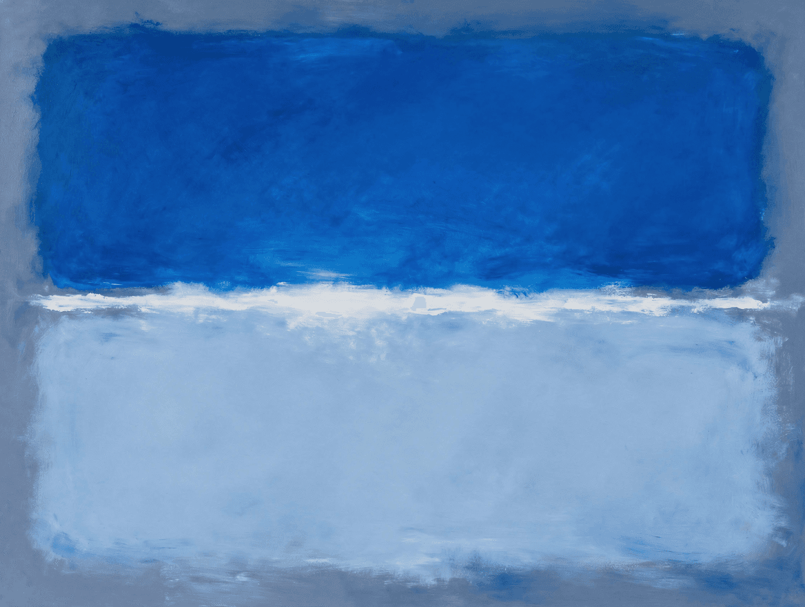
The two things you probably mean by "abstract wall art" both came out of postwar New York. Abstract Expressionism is the loud one: physical, gestural paint, like Jackson Pollock dripping house paint across a canvas on the floor. Its quiet cousin, Color Field, trades the gesture for vast, soft zones of color that seem to glow from inside, the look Mark Rothko made famous. Most abstract art you see at home today descends from one of those two.
Why it works on a wall
- It is hard to get wrong. With no figure or scene that has to look exactly right, abstract is one of the most forgiving styles to generate. Pick a palette and a strong composition, and it rarely misses.
- It sets a mood without taking over. A piece reads as calm, or energetic, or warm, without ever competing with the furniture or pulling focus from the room.
- It goes with anything. No era or subject to clash, so it sits as easily in a modern loft as a cottage.
- You choose the colors. This is the real advantage of generating your own: you can pull the exact tones from your sofa or rug instead of settling for whatever a shop happens to stock.
Where it works in a home
Over a sofa, go big and let one piece anchor the wall, a calm color field or a single bold gestural work both do this well. In a bedroom, lean calm: soft-edged color in a quiet palette reads restful. In an office or entryway, a louder gestural piece adds energy to a space you pass through rather than sit in. (Not sure how large to go? The wall art sizing guide has a chart for every spot.)
Prompts to try
The trick with abstract is to name a specific palette and a clear composition, then ask for the texture. Paste any of these into the studio and swap in your own colors.
Calm color fieldColor field painting in the spirit of Rothko, two soft-edged glowing rectangles of warm coral above deep teal on a bone ground, luminous and lit from within, feathered edges with no hard lines, calm and meditative, matte finish, not dark, not muddy
Bold gesturalAbstract expressionist composition, energetic gestural brushwork in deep indigo, ochre, and bone white sweeping diagonally across a warm ground, trailing drips and one decisive stroke, weight pushed off-center, matte flat color, no thick texture
Quiet and modernA single calm organic shape, a soft sand-colored arc on a warm off-white field, generous negative space, minimalist, matte, modern and serene
Matched to your roomAbstract color study in sage green, terracotta, and cream, soft blended shapes, calm and contemporary, matte, balanced to hang above a neutral linen sofa
Pick the palette that matches your room and start there. For the full menu of styles our AI handles well, the 10 art styles guide has all of them with prompts. Then make the one that is yours.