Bedroom Wall Art: How to Choose Art That Makes the Room Feel Calm
Every other room in your home performs for guests. The bedroom performs for you, at the two most vulnerable moments of your day: falling asleep and waking up. That gives bedroom art one job above all others, and it is not to impress. It is to calm.
What makes art feel right in a bedroom
You can hang anything you love anywhere you like. But if the goal is a room that helps you wind down, three qualities do most of the work:
- A soft palette. Muted, low-contrast color reads as restful: sage, sand, dusty blue, warm gray, blush. Save the electric palettes for the office or entryway, where energy is welcome.
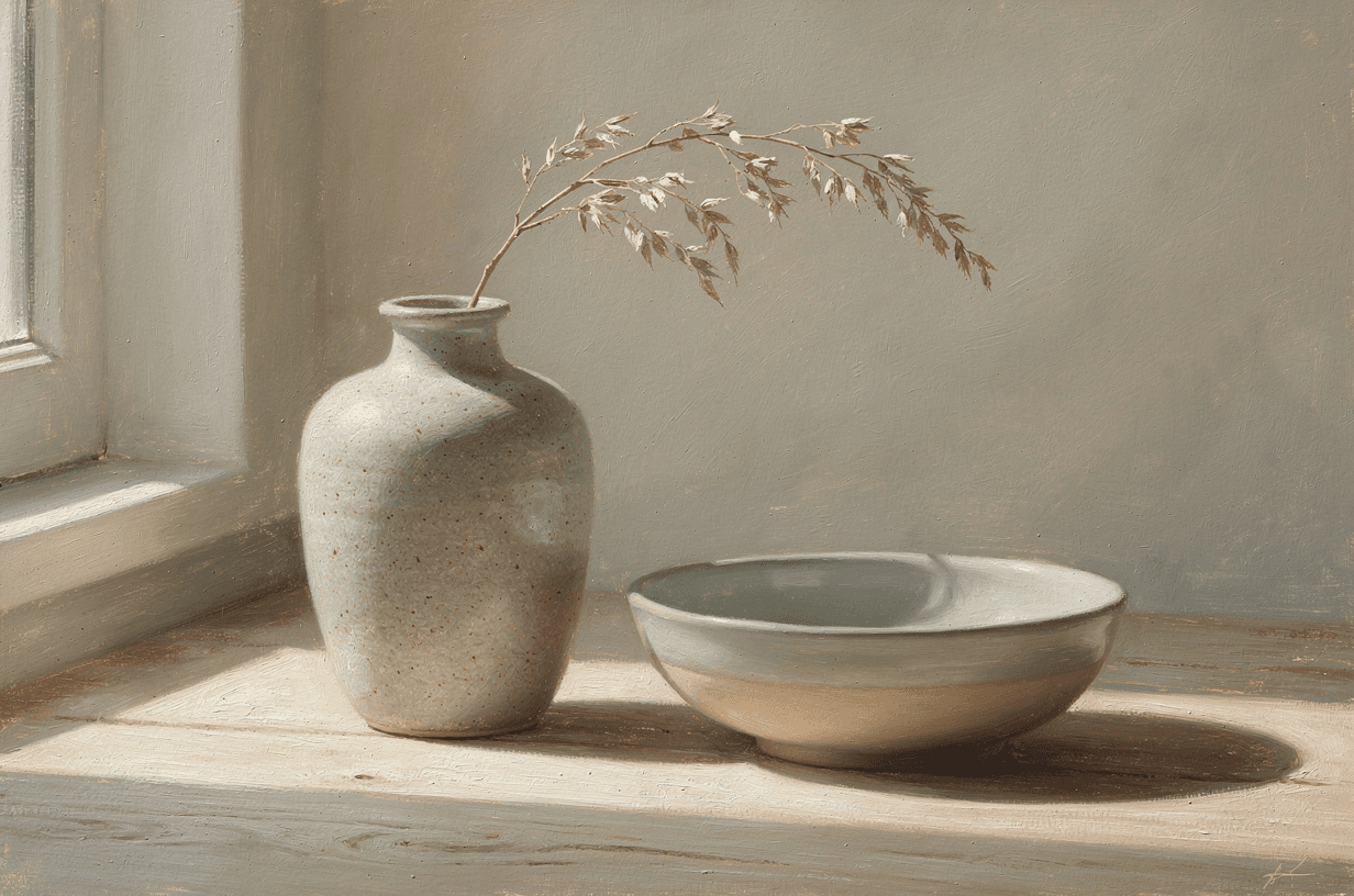
- Gentle subjects. Still water, soft landscapes, loose abstracts, botanicals. Anything your eye can drift across without stopping to think.
- Personal meaning. The bedroom is the one room where art does not have to explain itself to anyone else. A place you love, rendered quietly, beats a generic print every time.
The wall above the bed
The headboard wall is the natural anchor, and it rewards going bigger than feels safe. A single piece about two-thirds the width of the bed, hung so its bottom edge sits eight to ten inches above the headboard, reads intentional. A small print floating in all that space reads like an afterthought.
Landscape orientation suits the spot best, echoing the wide, low lines of the bed itself. For exact measurements by bed size, the wall art sizing guide has a chart you can keep.
Styles that keep it restful
- Color field abstracts. Vast, soft zones of color made for exactly this mood. The calm end of the abstract wall art spectrum is the bedroom sweet spot.
- Impressionist scenes. Soft light and loose brushwork, especially water and gardens. The impressionist guide covers why the style reads so gentle.
- Watercolor and botanicals. Airy washes and plenty of breathing room, quiet by construction.
- Minimal line work. A single flowing line on a warm ground, the japandi answer for modern rooms.
What to skip: hard geometry, high-contrast black and white, and anything with text. They all ask your eye to work, which is the opposite of the assignment. (For the full menu of looks, the 10 art styles guide walks through them all.)
The other walls
The wall you face from the bed is the one you see first every morning, which makes it the right home for the piece that means the most to you. Above a dresser, a portrait-orientation piece balances the furniture's horizontal lines. And a reading chair in the corner becomes a destination with one small, quiet piece beside it.
Make it personal
The most calming subject is often one you already carry with you: the lake from a favorite trip, the coastline where you got engaged, the field behind a childhood home. Upload the photo and the studio repaints it as a soft impressionist or watercolor piece, keeping the place while changing the medium. The turn your photos into wall art guide shows exactly how it works.
Prompts to try
Paste any of these into the studio and swap the palette toward the colors already in your room. Soft, low-contrast, and a little understated is the recipe.
Calm color fieldColor field painting in soft sage and warm cream, two feathered zones of color that seem to glow from within, no hard edges, calm and meditative, matte finish
Still water at dawnAn impressionist painting of still water at first light, pale lavender and soft blue with a band of warm rose at the horizon, loose gentle brushwork, quiet and serene
Soft botanicalA watercolor study of eucalyptus stems, muted greens and soft gray on warm white, generous negative space, airy and restful, matte
Quiet line workA minimal composition with a single flowing ink line over a warm off-white field, japandi calm, generous negative space, modern and serene
Start with the wall above the bed, go a size larger than your first instinct, and keep the palette soft. The room will do the rest every night after.