Watercolor Wall Art: Why Soft Color Works in Almost Any Room
Most art asks for a wall that suits it. Watercolor is the opposite: it adapts to the room it lands in. Soft edges, light passing through the color, and enough restraint that it never competes with anything else you own. It is the safest beautiful choice in the whole medium list.
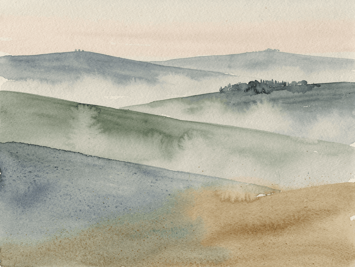
What makes a watercolor a watercolor
Almost every other medium works by covering. Oil and acrylic sit on top of the surface, opaque, one layer hiding the last. Watercolor works the other way around: the paint is transparent, so light travels through the color, hits the white paper underneath, and comes back up at you. That is where the glow comes from, and it is why a watercolor looks lit rather than painted.
It also means the painter gives up a certain amount of control, on purpose. Drop wet color into wet paper and it blooms and spreads on its own. Those soft feathered edges, the way two washes bleed into a third color where they meet, the speckled texture of pigment settling into the grain: none of that is drawn, it is what the water does. The medium was long treated as a sketching tool for studies until J. M. W. Turner spent a career proving it could carry atmosphere, weather, and light better than anything else available.
The practical upshot for a wall: watercolor keeps a lot of the paper. That untouched white is not empty, it is the part doing the work, and it is why these pieces feel like they add air to a room instead of weight.
Why it works on a wall
- It brightens without shouting. The pale, luminous palette lifts a room, which makes watercolor a favorite for smaller or darker spaces that need light more than drama.
- It goes with what you already own. Muted, low-contrast color is the easiest thing in the world to live with. It sits happily next to wood, linen, brass, or white walls without needing anything to match.
- It reads as handmade. Visible washes and paper texture look like something a person made, not something a machine printed. That warmth is hard to fake with other styles.
- It prints beautifully. Watercolor is flat by nature, so nothing is lost translating it to paper, unlike heavy oil texture that depends on real depth to look right.
Where it works in a home
The bedroom is the natural home, since soft color and calm are exactly the assignment there. A bathroom is the underrated one: watercolor suits the light and the scale, and a small piece transforms a room most people leave bare. Nurseries almost demand it, and a hallway or stairwell becomes far less like a corridor with two or three quiet pieces along it.
The one place to think twice is a room that needs a real focal point, like a large living room with a high wall. Watercolor can absolutely anchor a space, but you have to go big and commit to a stronger composition. (The sizing guide has the measurements for each spot.)
It is the friendliest style for your own photos
Watercolor is the most forgiving medium to convert a photo into, because the style is built on suggestion. Soft edges flatter faces, fur, and landscapes alike, and the loose treatment reads as an interpretation rather than a copy that has to be perfect. It is why a watercolor pet portrait lands so consistently, and why a favorite view from a trip works so well repainted from your own photo.
Prompts to try
The trick is to ask for what the water does, not just the subject: transparent washes, wet edges, bleeding color, visible paper texture, and plenty of untouched space. Paste any of these into the studio and swap in your own palette.
Misty landscapeA luminous watercolor landscape of layered hills receding into mist, transparent washes of sage green, dusty blue, and warm sand under a pale blush sky, wet-on-wet bleeds and soft feathered edges, granulating pigment texture, generous light negative space
Loose botanicalA loose watercolor study of eucalyptus stems, muted greens and soft gray on warm white, wet edges where the leaves meet the paper, lots of breathing room, airy and understated
Coastal washA soft watercolor seascape, a pale horizon with washes of turquoise and cream bleeding into each other, a suggestion of shoreline in a few darker strokes, bright and open, plenty of untouched paper
Quiet abstractAn abstract watercolor in overlapping translucent washes of blush, ochre, and soft slate, edges blooming where the colors meet, granulation and paper texture visible, calm and contemporary
Pick a palette pulled from the room it will hang in, ask for soft edges and open space, and watercolor will do the rest. For the other styles worth knowing, the 10 art styles guide walks through all of them with prompts.